 Miguel Escobar Published July 30, 2019
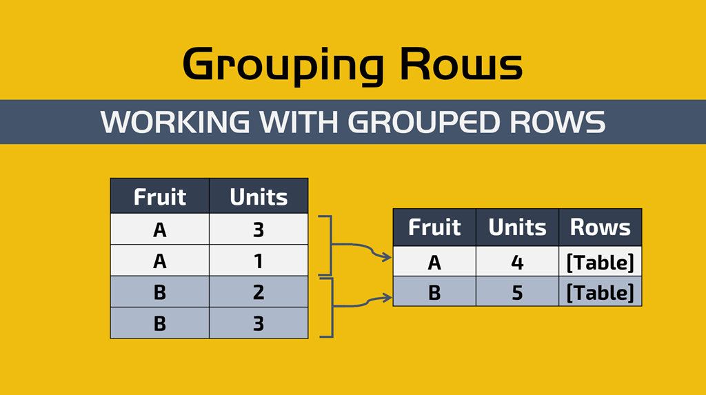
IMPORTANT: You can read the official documentation that Microsoft has on this topic from the following link (url).
Since it’s origins, Power Query / Power BI has had this feature called Group By and you can see it under the main menu and the Transform ribbon under the following icon:

is not a really descriptive icon. It doesn’t give you that much information other than something is dependent with something else (via that line).
What does Group by do? When should I use Group by?
In short, the Group By Operation inside Power BI / Power Query tries to do 2 things:
- Summarize your Data – you get your table summarized by only the columns that you select. This is amazing if you’re trying to get rid of duplicates or to check where you have duplicates.
- Provide Aggregations or Non aggregated Data – imagine these new columns that will provide aggregations such as the sum, max, min, average of a column and in some cases other columns that will not do any aggregation and will only the grouped rows as a table
You should use the Group By functionality any time that you need to do anything that has to do with grouping rows from a table based on the values that they have in their field/s.
Let’s go straight into real-world examples of when you might want to use this Group by feature and what it brings to the table
Be sure to click on the following button in order to download the sample file with also the solutions.
1. Summarize Data
Original Dataset: We have data that looks more like a report with all of the fields rather than something that we would use inside a Power BI / PowerPivot Data Model.
![SNAGHTMLa9353dd[4]](https://thepoweruser.com/wp-content/uploads/2019/07/SNAGHTMLa9353dd4.png "SNAGHTMLa9353dd[4]")
Goal: Normalize our dataset and create a Customers Dimension Table for our Power BI Data Model. We would have a fact table with only the customer key and another table with all the fields for customers.

How to group rows with Power BI / Power Query for this ?
Here’s the step by step of what we need to do:
- Head over to the sheet 1 or, if using Power BI Desktop, connect to the table within the sheetname “1” from the sample workbook.
- Name this Query “Original”
- Reference the “Original” Query twice and name one of those references “Dim_Customers” and the other one “Fact_Sales”
Now that we have these 3 queries, the whole goal is to only load the “Dim_Customers” and the “Fact_Sales” to our Data Model.
In a more technical sense, we are dealing with what it’s called a denormalized table and we need to normalize it (reduce the redundancy of data) by basically moving most of those fields to a new table and only keeping 1 field that will act as the “key” for our customers. I just so happen to call that field “CustomerKey” to make it easier for this example, but in the real world it might be called something else.
Creating a Dimension table for Customers
Let’s work on that “Dim_Customers” query. In the original table you’ll see that I marked some columns with a yellow color. I did this because all of those fields are all referring to a single “object” or “element” and that is the customer.
Click on the Group By icon and then in the Group By window select the Advanced option. Then for the Group by fields select CustomerKey, Customer, Category, Group, Primary Contact as shown in the next picture:

The rest you can leave it as default.
The result will be a summarized table with no duplicates for our customer fields and a new column called “Count” which we can just remove. After removing that “Count” column, you’ll end up with your table exactly as you need it:

Normalizing our Fact Table
Our goal with this query is super simple. Let’s delete all of the fields that have anything to do with the newly created dimension table for customers, but keep the CustomerKey field so we can create the relationship between tables.
In a more visual way, let’s delete the fields highlighted in red in the picture below:

You simply select those fields in red (Customer, Category, Group, and Primary Contact) and then do a right click on either one of those columns and select the option that reads “Remove Columns”:

The result of that operation will give you a table that looks like this:

and with that you have your Fact_Sales table ready to be loaded to your Data Model.
Building our Data Model and creating the report
if you’re in Power BI Desktop, you can select your queries from the “Queries” pane and make sure that only the Fact_Sales and Dim_Customers load to your Data Model, but inside of Power Query for Excel you need to first load your queries as “connection only” and then load them to your Data Model.
The main key here is that you need both of those tables / queries that we just created in your Data Model and then inside of it you can create a relationship between those 2 tables using the CustomerKey field from both tables. You can simply drag one field from one table to the field of the other table using the Diagram view and the app will create the relationship for you. The end result will look like this:

With that out of the way, you can focus on just creating your report. In my case, I ended up creating this report inside of Excel which is basically a top 10 customers by order total from each Customer Group

Takeaways
The main takeaway here is that this principle can be used for any Dimension or any type of Normalization scenario that you can think of.
There is another valid way of doing this and that is by simply keeping the columns that you need and then remove the duplicates from those columns. Again, completely valid but its a matter of preference at that point.
2. Summarize Data and Add Aggregations based on Grouped Rows

Original Dataset: similar dataset to the one from the first scenario, but this time it has more fields
Goal: Create a high-level report that gives us a summary of the current month’s performance
How to group rows and add aggregations with Power BI / Power Query?
Similar to the first case, we need to grab the data which is on the sheet with the name “2”. The name of this table is “Example_2” and all you need to do is connect to it and you’ll notice that this is a a report with 18 columns and a lot of rows.
Grabbing current Month’s data
The first thing that we need to do is add a filter to our OrderDate column so we only take in consideration the current month’s data. I crated this sample file so that you always get a set of dates based on your current time, so it should always work.
The filter that we want to do is inside the Date/Time FIlters, Month, and then “This Month”:

That’ll make sure that we’re only taking in consideration the orders for the current month.
After that’s done, we can move forward with doing the actual Group by operation.
Creating a summary report with Group By
Now it comes the part where you can hit the Group by button and make it look like it shows in the next picture:

To summarize what we’re trying to do:
- We want to Group all the orders by City
- Based on that grouping, we want to get
- The total orders (doing a count of all the rows that match the city)
- The total Quantity of units sold
- The total revenue
Then I did a quick sorting based on the Total Revenue and the result of that operation gives us this:

Takeaways
I’m seeing this feature being used more and more inside of Microsoft Flow where people connect to their SQL Server Database to create extracts that are later emailed automatically as an HTML table (a final report) to an executive that requires to see this data on their own schedule or based on alerts to see specifics of a specific set of records that are grouped based on conditions (using the Group By).
Extremely useful! if you need to summarize your data without the need for interactivity, like in pivot tables, then this might be all that you need.
3. Summarize Data, Add Aggregations and expand Grouped Rows

Original Dataset: We have an industrial refrigerator where we dry age our meats. Within this refrigerator we have an IoT (Internet of Things) temperature sensor. It records the temperature every minute of the day and this is the dataset of a single day.
Goal: We want to compare the average of the day against every single minute and find out the minutes where the temperature was 5% above or below average to later investigate.

How to group rows and add a non-aggregation column with Power BI / Power Query ?
This is an excellent example to showcase some of the hidden gems when using the Group by feature.
As always, we have to go to the table for this case which is inside Sheet # 3 and load that data to Power Query.
The exact click that we need to take is the one against the “Group By” and then we need to have our Group by as shown below:

Notice that the only Group by field is the ID of the fridge and then for the New Columns we have one that does the Average of the Temperature Column (which has the temperatures in Fahrenheit) and then we have another column that we called “Rows” that does an “All Rows” operation.
After hitting OK, we get this:

How to work with grouped rows in Power BI / Power Query?
Pay close attention to that “Rows” column which holds a Table. That table holds ALL of the rows from the previous table. What we need to do is click on the icon on top of it (that look like two arrows going in opposite directions) and then we do an operation that’s called “Expand Operation” where we select the columns that we want to expand which are all except the Fridge ID and that interaction will look like this:

and once that has been applied, we’ll have a table similar to the initial one, but with the “Day Temp Average” which is the average temperature of the day:

After this we can do our magic with a custom column (go to the Add Column menu and select Custom Column) and add the simple formula shown below:

We then go towards more operations in order to get the difference between these 2 columns, but what I ended up doing was simply using this new column “Difference”, I then transformed that into an absolute value, and filtered to only get the values that are higher than 0.05 (or 5%) so I could end up with the following output:

This is all the minutes where the temperature was 5% above or below the average, which was around 34 degrees F.
Just keep in mind that you should keep your dry aging fridge at around 34 – 38 F.
Takeaways
What’s so amazing about what we just did? The key of it all is the way that we can use the “grouped rows” to actually re-expand those rows and use the average of the whole dataset against every single row. You could’ve done multiple aggregated columns like MAX, MIN and others, but for this case I went with just the average, but you can leverage so much more than that AND it absolutely works when you have multiple instances of Group By. If you had, for example, another fridge, then the technique will still work – you wouldn’t need to change anything from the query itself. It’ll just work.
In the next example I’ll show you how to go even further and to do more advanced “leveraging” of the “Grouped Rows” tables.
4. Use M Functions against Grouped Rows

Original Dataset: We have a report of the sales for the year 2018 by Customer, Region. and Country.
Goal: We want to summarize this report to only have the top 3 customers, based on the revenue field.

This scenario is not as easy as the rest. It is not as complex as you might think either. It’s all about having a good understanding of how to work with the “Grouped Rows” that are on that column with table values. that we saw in the previous example.
How to group rows, add an aggregation column, and add a non-aggregation column with Power BI / Power Query?
As always, we have to go to the table for this case which is inside Sheet # 4 and load that data to Power Query.
The table that we’re looking for is named “Example_4” and once you get that data inside Power Query / Power BI, create a reference of that query. Rename this new query to be “Output”.
The step by step is clean and easy. In this new query, hit the Group By button and group by “Region” and add a new column with the operation “All Rows” as showcased below:

and the result of that will look like this:

Notice what I did. I clicked the whitepace right next to the “Table” value and I got a preview of the contents of that table in a value preview window right underneath. How cool is that?
How to work with grouped rows? how can we order, rank and index these rows / records with Power BI / Power Query?
OK – let’s revisit our goal. What we need is to extract the top 3 customers from each region based on the value that they have for the Total column sorted in a descending order. Notice something special about our table? Yeah, it’s not sorted correctly
So what we need to do is:
- Sort the data by the Total Column
- Keep only the top 3 rows
- Adding an Index or Ranking
- Expand the Table
- Enjoy our report!
Let’s go with each one now
Sort the data by the Total Column
Since the data that we need is inside a Table, we need to use Table functions against it. To do a sort, the table function that we need is Table.Sort and we would use it in a custom column like this:

The Table.Sort functions requires a Table as it’s first parameter and then a list on the order of the sorting and the type of sorting that shall be applied to each column. That’s how we ended up with the formula:
Table.Sort([Grouped],{{“Total”, Order.Descending}})
Keep only the Top 3 Rows
Ok! We have each table in that column sorted. We can now just keep the first 3 rows and remove the rest. To do that we use a function called Table.FirstN. This is how it looks like when I use it for a custom column:

Check this out, instead of using the table from the “Grouping” column, I’m now using the “Sorting” column which has the sorted table. This will create a new column with the name “Keep Top 3” using this formula:
Table.FirstN([Sorting],3)
Adding an Index or Ranking
Now we move to the final part of enriching those grouped rows tables by adding a new column to each table to denote the order or rank of each row using an Index. This time we’ll be using the Table.AddIndexColumn function like this:

and look how nice our table looks in the preview window underneath?
Expand the Table
All we need to do now is simply get rid of the “Grouped”, “Sorting”, and “Keep Top 3” columns and we’ll get a simplified query like this:

and last but not least, we expand this table column and we get the report that we’re after:

Enjoy our report!
Before we can enjoy our report, I need to warn you about something truly specific to Power Query.
When we do a Sorting operation or some operations that require to know the position of a specific row in a table, it is recommended that you buffer the table before doing so.
What is buffering? you might ask. The idea of Buffering in Power Query terms is that you cache your data in memory so that you only need to read your data once and apply the transformations over that buffered / cached data. Otherwise the sorting might not be conformed / kept after doing the expand operation or some other type of operation.
There are a few ways to apply this buffering. You can apply it directly on the “Grouped Rows” table or you can also do it on the first step of this query so we would be working with cached data from the very start. Let’s modify the “Sorting” column to have the following formula:

Takeaways
This is the true power behind Power Query. How within a table you can have another column with table values and apply table functions with them and design some really clever ways to tackle scenarios. This is a completely new way of thinking that you don’t find in Excel or DAX.
One key feature here is that instead of creating so many columns, we could’ve created our own custom function and do everything in just one step. You can read more about how you can create your own custom function from any of these articles:
Conclusion
We’ve seen all of the possibilities that Group By brings to the table. it fundamentally changes the way that we see and tackle scenario and this is one of the reasons why we need to stop tackling scenarios in Power Query the same way that we would in Excel.
Power Query is on a completely different level which makes it feel more like the movie “Inception” because of how you can be working with so many different levels and nodes within a single view of the data.

Be sure to let me know your comments about this type of longer blog post!


Hi Miguel,
No. 4 is the highlight for me, it’s so much easier &faster creating a Topn-list in PowerQuery than in PowerBI with DAX!
Thanks again for your articles!
Cheers,
Sebastian
glad that you enjoy the articles!
Great walkthrough. It feels really cool to keep working directly with nested tables to tweak out the result you need before expanding it.
Recipe 4 definitely an eye-opener!
Does make me think, though, that there should be the option within M / Power Query of a rank operation either within the Group By menu, or somewhere else (instead of using the index column, which is an excellent idea). Maybe it exists and I haven’t seen it.
aggregations are usually a pretty CPU intensive operation in Power Query and it could have terrible performance. From my experience, trying to make aggregations or figure out rankings with Power Query is even slower than doing a similar aggregation with just traditional Excel formulas, so I can understand why Microsoft decided to only show you a few choices in that “drop down” for the new column aggregations.
Nevertheless, using the index can be, most of the time, a good enough approach for scenarios where you need to define an order.
Thanks a lot for this tutorial. Sample 4 was just what I needed and had been looking for for too long.
Hi, i already grouped in power query and added an index column, now i want to get the next row from another column so i thought that using a lookup value in DAX searching by the index would be ok, but i´m getting an error since there are multiple values repeated(example for every group theres is a 1 ,2,3,etc) so the lookup value doesnt work.
Is it possible to do it? i tried to use filters but can´t make it .
I´m no t an expert and can´t fin the way.
Hey! I’m not sure I follow. Do you need to make this happen with power query or Dax ? If it’s with dax, I’m guessing that it’s a calculated column, right ?
This is a terrific article – well-planned, well-organized, and to the point!
Great article!
What if the GUI does not show me any column when the”all rows” operation is selected?
Hey! I don’t think it should. The “all rows” is supposed to just grab all rows so selecting a column wouldn’t make any impact on it.