 Miguel Escobar Published September 16, 2019
Last week I started this series where I cover how we perceive Data Visualizations in our daily lives.
If you haven’t read Part 1 yet, I highly encourage you to start reading it now here.
I started this series with how videogames are most commonly using data visualizations. I even created a report for one of my favorite games (Destiny 2), but even before that the first ever data visualization that I ever saw in my life was actually watching a baseball game.
See, I was born and raised in Panama City, Panama. In the 90s, and even to this day, Baseball was/is one of the most common sports that you’ll see people playing here.
It was pretty special during the 90s because of 1 guy:

(Mariano Rivera)
He made his debut on the MLB on 1995 and is a member of the Baseball Hall of fame.
Data Visualization at a Baseball game
You’re probably wondering, “what was that first data visualization that you saw at a baseball game?”
It was nothing more than the scoreboard.
Tables, matrix, or grids are essentially the most basic way to display data. Despite them not having any of the cool charts, backgrounds or colors that we see in some new modern interfaces, they always deliver the necessary information.
Check out this report that I created to showcase the point:
So why a table? It’s a valid question!
Even to this day, and at the highest level of the sport, you’ll still see people using tables to display the scoreboard of the game. The only difference is that they are using digital boards now instead of the old ways.
Are there any possible improvements to the scoreboard?
Absolutely. These mainly have to do with what you can do within a table and the environment on which you need to display that scoreboard.
For example, in the report that I created I added conditional formatting to the current inning and team at play. The value is a bit brighter than the rest to denote that it’s the current play.
You could also some conditional formatting for the background of the cell.
And last, but not least, you’ll often see that the columns in the scoreboard of some stadiums are padded and grouped. For example, you’ll see the first 3 innings as part of a group of columns, then a space between the 3rd and the 4th inning where the 4th to 6th inning are similarly grouped and then the 7th to 9th inning are also grouped, where the 6th and 7th inning have a space or gap in between them.
How some Pros are using Tables / Matrixes / Grids
The timing could not have been better. My good friend Rob Collie just started posting again on his blog and he has a new interesting project.
If you’re a fan of the NFL or American Football then he has something for you.
Click on the images below to check out his reports and projects:


They look cool! I know absolutely nothing about the NFL or the sport, but the reports look cool and if you’re a fan of the NFL or the sport I’d love to know your thoughts about Rob’s reports.
Conclusion: never underestimate a Table, Matrix or a Grid
The usual rule of thumb with data visualizations is that if you look at it from a few feet and it starts looking like just a blob, then it might be too difficult to distinguish the reports and you need to let our design “breath”.
This usually happens with tables, matrixes and grids where they can display too much information at times, and it might be too difficult to draw some insights out of it from a quick glance.
That’s where something like conditional formatting comes into play:
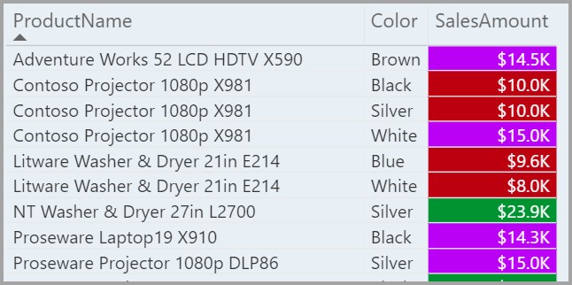
With Power BI you can use conditional formatting for:
- Font color
- Background color
- Icons (and custom icons)
You have a vast array of options when it comes to conditional formatting in Power BI and I encourage you to give this a try.
Tables can be an amazing way to provide useful information at a quick glance and Conditional Formatting helps you guide the end-user to focus on the most important aspects of that data visualization.
At times, a simple table can be the most effective way to deliver the required information, like it has with certain scoreboards on multiple sports where the information is needed at all times, on real time and also visible from multiple angles (hence why they use the colors that they use).
Let me know in the comments below what data visualization do you see on your day to day that you’d love to use with Power BI.
Be sure to sign up to this blog so you can receive a notification once the next blog post in this series gets published next week.


Good. But relevant content should be more
Hey Nadir!
When you say relevant content should be more, are you referring to the data shown in the matrix ? Or what exactly?
A table is worth 10 visualization